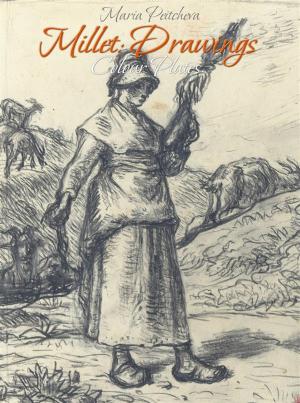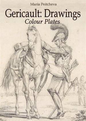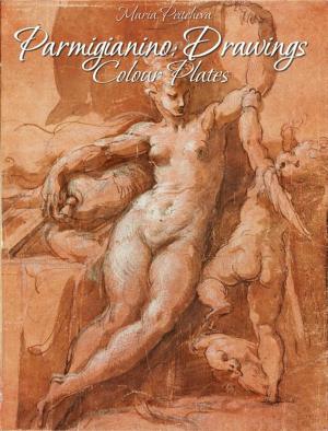
| Author: | Maria Peitcheva | ISBN: | 9788822859174 |
| Publisher: | Maria Peitcheva | Publication: | October 24, 2016 |
| Imprint: | Language: | English |
| Author: | Maria Peitcheva |
| ISBN: | 9788822859174 |
| Publisher: | Maria Peitcheva |
| Publication: | October 24, 2016 |
| Imprint: | |
| Language: | English |
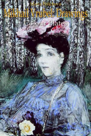
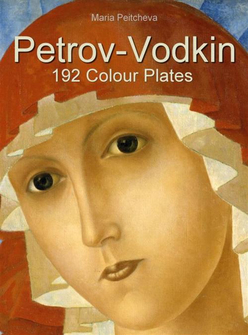
Kuzma Sergeevich Petrov-Vodkin, (1878 – 1939) was an important Russian and Soviet painter and writer.
Petrov-Vodkin extensively used an aesthetic of Orthodox icon together with brighter colors and unusual compositions. His works were often deemed irreligious and erotic. From 1924 to 1926 Petrov-Vodkin lived in France with his family. During his earlier years, Petrov-Vodkin developed his "spherical perspective": a unique twist that distorted the drawing as to represent the viewer high enough to actually notice the spherical curve of the globe. He used it extensively through his works like Death of a Commissar and In the Line of Fire, which make the observer seem more distant, but actually close. It is argued that this twist has been built upon Byzantine perspective - an inverted perspective used in iconography. Petrov-Vodkin used darker tones with time, but his paintings became more detailed. He started painting still life and portraits, stepping further away from his previous themes.